Client: Matt, Empower Health Concepts
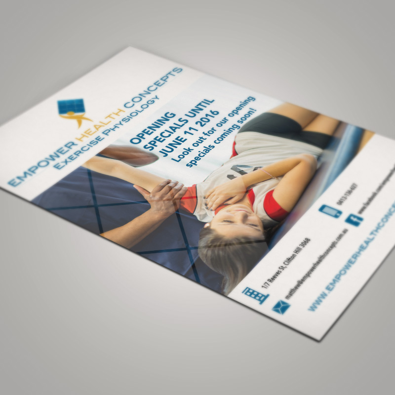
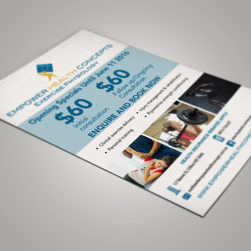
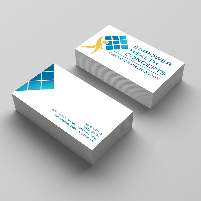
Working with Matt the owner. I sat down with him to discuss some elements he would like in his new identity. One of those things he hoped to implement was a Rubix cube. It was a personal touch which I wanted to include. So as you can see in the logo and in some of the collateral created, there is a 9 block grid to give a nod back to that Rubix cube. From there we worked on his colour palette and since then I have worked on his posters, flyers, video work and other marketing collateral.
Here are some samples and mock ups.
